Spaces with substance
From BlackWhite magazine - issue 11, red alert
Designing spaces with intention in an age of aesthetic overload.
Fatigue from endlessly scrolling social media is leading to an anti-trend movement where authenticity is admired over skin-deep aesthetics.
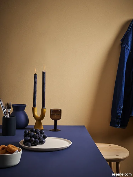
Wall in Resene Corvette, table and vase in Resene Avalanche, candle holder in Resene Hot Toddy, cutlery holder in Resene Cinder, plate in Resene Quarter Canterbury Clay and bowl in Resene Quarter Thorndon Cream. Stool from Good Form.
Thanks to the internet and social media, our industry is experiencing unprecedented access to inspiration, new materials and the ability to source furniture, fixtures and décor from anywhere in the world. However, this interconnectedness can be a double-edged sword. Not only can it be harder to be decisive in the face of endless options, but we also find ourselves wading through a rising tide of noise that attempts to reduce design to aesthetic content and a surface-level spectacle in pursuit of likes, follows and engagement.
Good design, of course, should never be dictated by aesthetics alone. It is, at its core, a practice of listening: to clients, to the environment and to history. In indigenous cultures, land and place are not just passive backdrops; they are active participants in the design story. The concepts of whakapapa for Māori or Country in Aboriginal culture challenge us to think not just in terms of style, but in terms of belonging. When we embrace these considered approaches, material selections are no longer just about colour or finish – they become about continuity, sustainability and care.
Our fatigue for endless scrolling seems to be fuelling a palpable shift. The era of aesthetic overload has reached its saturation point, and in its place, a quieter, more grounded design sensibility is emerging that prioritises substance, longevity and personal resonance over visual novelty. This movement is reshaping not only what colours we choose, but why we choose them. Rather than chasing seasonally dictated palettes, more designers are turning to tones that hold emotional weight and cultural relevance. In the coming months, we will see far fewer changes in colour trends. Instead, a deeper transformation in how designers and clients approach space, meaning and mood is taking place.
This return to substance doesn’t mean a rejection of beauty or innovation. Rather, it’s a redefinition of both. Personalisation is stepping into the spotlight, with clients increasingly seeking interiors that reflect their values, histories and lifestyles. In residential projects, this might take the form of heritage colour references or tactile, natural materials that tell a story. In commercial offices, we’re continuing to see a shift toward environments that nurture emotional connection, with colour playing a critical role in crafting these narratives. In both contexts, the emphasis is on creating interiors that mean something – spaces that are not only visually appealing but emotionally resonant and relevant.
It is worth pointing out that, while commercial offices and institutional interiors can be natural candidates for slower and more considered design approaches which aren’t as influenced by shifts in colour trends, retail, salons, restaurants and other hospitality spaces often need to take a trend-forward approach and undergo more frequent updates to stay relevant amidst a competitive landscape. These environments thrive on immediacy and impact, relying on bold, current aesthetics to attract and engage customers. Colour continues to play a vital role in creating memorable, immersive brand experiences – whether through vibrant feature walls, unexpected palettes or seasonal refreshes.
For those with projects that need to reference the top trending tones in the coming six to 18 months or those simply seeking out fresh inspiration, look no further than these Resene paint colours for creating immersive, on-point spaces that resonate with today’s design direction. Whether you’re aiming for subtle sophistication or bold visual impact, these curated hues offer the perfect starting point for thoughtful, future-focused interiors that don’t just follow trends but help define them.
A new dawn for yellow
Initially gaining traction on international fashion runways last year, yellow has since transitioned confidently into interior and architectural palettes – particularly butter yellows and softer, more nuanced tones like Resene Marzipan and Resene Essential Cream. Yellow’s strong resurgence can be attributed to a collective desire for optimism and comfort in the face of uncertainty, and in a time where emotional resonance in design is increasingly valued, there’s nothing like yellow to bring cheer, warmth and individuality to a space.

In an increasingly complex world, warm and comforting colours are being prized for the positive psychological benefits they offer to project users.
Tabletop painted in Resene Corvette with gridlines in Resene Hot Toddy, chair, mug and cutlery in Resene Cinder, floor and right salt dish in Resene Avalanche, plate in Resene Quarter Thorndon with stripes in Resene Avalanche, side plate and left salt dish in Resene Hot Toddy, large plate in Resene Quarter Canterbury Clay and bowl and coaster in Resene Quarter Thorndon Cream.

For project typologies that will naturally continue to be more trend-focused, such as retail, restaurants and other hospitality settings, creating a personalised, bespoke look that sets our clients’ spaces apart is important for helping them stay relevant in an increasingly competitive landscape. And in these types of spaces, boldness can pay dividends
Front wall in Resene Avalanche, booth walls in Resene Quarter Canterbury Clay, floor in Resene Hot Toddy, table in Resene Quarter Thorndon Cream and chair and cutlery holder in Resene Cinder. Booth seats from George and Willy, rug from Good Form, cutlery, cups, plates and bowls from Acme.
While some may find yellow too bold or brash for refined interiors, when harnessed with sensitivity to light and context, yellow can elevate a project in a way that other hues can’t. In both residential and commercial settings, yellow serves well as an ideal counterpoint to the muted, cooler palettes that have dominated over the past decade, offering a visually uplifting alternative without sacrificing sophistication. For architects, trending yellows like Resene Hot Toddy and Resene Galliano offer a powerful tool to draw attention to form and detail, particularly when contrasted against concrete, timber or dark neutrals. Interior designers are equally capitalising on this hue’s positive psychological impacts, using yellow on walls, ceilings, accent furnishings and décor to create inviting, contemporary spaces that balance vibrancy with warmth.
As we look ahead in the long-range forecast, we’re likely to see softer butter yellows begin taking on greener undertones in the coming year. While green yellows like Resene Chino, Resene Karma and Resene Bullwhip aren’t as overtly optimistic, it’s likely that many designers will find them easier to work with as they lend an undeniable earthy sophistication that’s ideal for taking an understated approach to interior colour palettes.
Red’s renaissance continues
It’s no secret that red has surged to the forefront of contemporary colour trends, reclaiming its place as one of the most emotionally charged and impactful hues in a designer’s toolkit. This confident colour’s resurgence speaks to a broader craving for boldness and authenticity in response to years of muted palettes and restrained minimalism. Red’s inherent energy and intensity make it a natural choice for those looking to inject personality and presence into a space. Whether used as a commanding feature or a nuanced accent, red has the undeniable power to evoke emotion and create an immediate sense of atmosphere.

Today’s top reds, creams and pinks are unexpected options for creating a fresh colour palette alongside butter and ochre yellows.
Background painted in Resene Quarter Canterbury Clay with faux grout lines in Resene Marzipan, tray in Resene Burnt Sienna and clipboard in Resene Quarter Canterbury Clay.
Top box in Resene Bianca with gridlines in Resene Marzipan, bottom box in Resene Bullwhip, small box (top right) in Resene Vintage with gridlines in Resene Bianca, scissor handles in Resene Vintage and book in Resene Bianca with stripes in Resene Marzipan.

Those looking to embrace the diverse array of trending yellow tones, from soft buttery hues like Resene Popcorn and Resene Splash to saturated sunflower and ochre yellows like Resene Sunflower and Resene Buttercup, will find plenty of versatile options to evoke a sense of energy, creativity and lightness in their project.
Front wall painted in Resene Marzipan with gridlines in Resene Burnt Sienna, back wall in Resene Burnt Sienna with gridlines in Resene Marzipan, floor in Resene Quarter Canterbury Clay with faux grout lines in Resene Marzipan, stool top in Resene Bullwhip, vase in Resene Bianca and boxes in Resene Bianca (top) and Resene Bullwhip (bottom). Table from George and Willy, chairs from Tim Webber, pinboard from Made of Tomorrow.
Interestingly, while red’s popularity has continued to rise, the vast variety of trending red tones has been distilling down into two distinct and dominant categories: vibrant hot reds and rich earthy reds. On one side, bold capsicum-inspired reds like Resene Pursuit, Resene Red Hot, Resene Roadster and Resene Smashing are fiery options for delivering unapologetic vibrancy and heat. These shades are ideal for dynamic spaces like retail and hospitality environments where energy and immediacy are key. Alternatively, deep, grounded hues like Resene Burnt Sienna, Resene Rustic Red, Resene Avant Garde and Resene Volcano are more introspective and comforting, making them perfect for layered, meaningful spaces that prioritise warmth and character over fleeting visual drama. Together, these two trending types reflect the duality at the heart of today’s design ethos: the balance between bold expression and grounded authenticity.


Blue’s evolving appeal
Blue continues to be a cornerstone of contemporary colour trends, prized for its versatility, emotional range and enduring appeal. Its popularity spans across all project typologies with trendy and classic options that run the gamut from calm and contemplative, to bold and energising, to subtle and sophisticated. Unlike more polarising hues, blue has a universal quality that’s rooted in nature through sky and sea which gives it an innate familiarity and comforting – making it an essential tool for shaping atmosphere and defining character.
What’s striking about blue’s current popularity is the diversity of tones that are trending simultaneously, reflecting the breadth of its appeal. Inky and near-black blues like Resene Avalanche and Resene Cinder bring a sense of drama and depth, often used to anchor spaces or add moody sophistication. Bold cobalt and ultramarine blues such as Resene Resolution Blue, Resene Aviator, Resene Ultramarine and Resene Lapis Lazuli continue to be top accent options that offer vibrancy and confidence that are perfect for feature elements in expressive, modern spaces. Meanwhile, livelier mid-tones like Resene Endeavour and Resene Picton Blue inject freshness and a playful energy which are ideal for spaces that need to feel dynamic and engaging. At the softer end of the spectrum, delicately nuanced hues like Resene Wedgewood and Resene Duck Egg Blue create gentle, serene environments that exude understated elegance.
Over the next two years, these blues will continue to prove their versatility not only as classic choices but as nuanced players in complex, contemporary colour schemes. But for those working on projects with longer timelines, it’s worth noting that trending blues will take on purplish undertones as early as next year, when we’ll see a wave of violet-influenced periwinkle options like Resene Ship Cove, Resene Float and Resene Hawkes Blue rise to the forefront. These evolving tones pair beautifully with soft greys, chalky whites, muted mauves and dusty neutrals such as Resene Concrete, Resene Rice Cake, Resene Abbey Road and Resene Smooth Operator creating layered, elegant palettes that feel both fresh and refined.


Greens get warmer and wilder
Green has maintained a steady presence in the colour trend forecast as a favoured hue thanks to its deep associations with renewal and balance. Across New Zealand and Australia, where the outdoors play a central role in how we live, work, and design, green offers a sense of continuity between our built and natural environments. Over the past decade, designers have gravitated towards cleaner, cooler greens like Resene Home Run, as well as greyed-off and blue-based greens such as Resene Tasman and Resene Innocence, which brought a calming, contemporary edge to interiors. These tones aligned beautifully with the minimalist and Scandinavian-inspired palettes that have dominated in recent years.
However, the coming year will usher in a warmer evolution of green where we’ll see a clear shift toward greens edged with yellow and brown. Pale, mellow shades like Resene Half Chill Out, Resene Nirvana and Resene Green Spring will enter as subtle, sun-warmed alternatives to cooler pastels. In the mid-tone range, colours like Resene Green House, Resene Celery, Resene Grass Hopper and Resene Lichen strike a balance between retro and rustic that works well in both contemporary nature-infused schemes as well as throwback and heritage-inspired spaces. For deeper contrast, bushy, forest-inflected greens like Resene Woodrush provide richness and depth without overwhelming more delicate palettes.
Looking further ahead, seaweed-inspired greens such as Resene Kombi and Resene Saratoga are poised to re-emerge. Whether specified to evoke a sense of calm, to reinforce biophilic design principles or to serve as a versatile backdrop to bolder accents, these moodier greens are particularly adaptable and relevant and will be a vital element when designing spaces with substance.
Like yellow, peach tones are popular for bringing positivity. Pair them with soft blacks, dreamy creams and earthy greens for an effortlessly rich colour scheme.
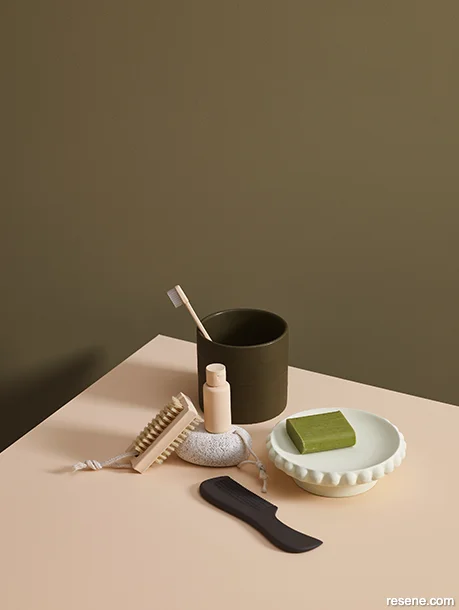
Wall painted in Resene Lichen, tabletop, toothbrush, nail brush and bottle in Resene Negroni, soap dish in Resene Half Chill Out, pumice stone in Resene Rice Cake and comb in Resene Nocturnal.
Greens continue to be a top colour choice. However, greyer and bluer greens are evolving into warmer, earthier tones influenced by yellow and brown – offering a grounded, organic feel for anchoring contemporary spaces.
Main wall painted in Resene Woodrush, alcove and coat rack in Resene Rice Cake, cabinet doors in Resene Negroni, floor in Resene Lichen with faux grout lines in Resene Woodrush, lamp in Resene Half Chill Out and side table in Resene Nocturnal. Chair from Good Form, cup and saucer from Acme.
Peach persists, pink refines, purple retreats
Like the uplifting effect that yellow offers, the design world’s affinity for peach has only intensified this year as warm and fuzzy tones such as Resene Roxy, Resene Negroni, Resene Porsche, Resene Corvette, Resene Romantic and Resene Tacao continue to offer consoling softness in the face of a complicated world. Looking ahead, this affection isn’t expected to wane and these hues will remain a feel-good staple well into the coming year.
As the dust has settled on the ‘Barbiecore’ era, pink’s place in the long-term forecast is shrinking. While the enthusiasm for rosy tones certainly hasn’t vanished entirely, the tones that are trending have become far more selective. Expect to see ongoing use of standout options like Resene Cest La Vie, Resene Lipstick, Resene Scrumptious and Resene Cosmos which will remain relevant and impactful accent options.
As for purples, their role in colour forecasts has also diminished considerably. Aside from a few enduring shades such as deep plum, aubergine and mauve like Resene Fandango, Resene Half Aubergine and Resene Vintage, purples have largely fallen out of fashion. The notable exception to this shift lies in the periwinkle blues previously discussed, which will make up for the absence of overtly violet tones in trending colour palettes.
Despite the reduction in variety, these select pinks and purples offer a memorable and expressive layer to any design scheme when thoughtfully applied – and they will continue to be popular among youthful clients. Albeit more focused, their enduring presence makes them ideal for injecting personality without straying from the pulse of contemporary trends.
Warm neutrals maintain staying power

Brown-edged greens act as a grounded counterpoint to popular pastels like peach and pink, bringing depth to balance airy palettes.
Wall painted in Resene Rice Cake, skirting board in Resene Woodrush, floor in Resene Lichen with faux grout lines in Resene Woodrush, bench in Resene Half Chill Out, small bowl in Resene Nocturnal and spoon handle in Resene Negroni. Table from George and Willy, cup and saucer from Acme. Projects by Amber Armitage, images by Melanie Jenkins.
Among all the colour families, neutrals continue to be the most stable and strategically reliable choices within contemporary design. In an evershifting landscape of colour trends, today’s most sought-after neutrals are expected to remain relevant for years to come. For architects and interior designers seeking longevity and broad appeal, these hues offer a solid foundation that aligns seamlessly with both current sensibilities and future-facing aesthetics.
Unlike other colour families that are experiencing noticeable tonal shifts, today’s most popular neutrals are undergoing a process of refinement rather than reinvention. The heyday of quiet luxury and stealth wealth seems to be behind us, where essentially any warm neutral was fair game. Instead, the focus is narrowing to a more simplified selection of neutrals that feel timeless, versatile and elevated. Expect fewer neutrals to be labelled as ‘trending’ in the coming months, with an emphasis on those that offer subtle complexity like soft putty and tan tones and complex stone gravel hues that pair seamlessly with both bold accent colours and nature-inspired palettes. Refined neutrals like Resene Desert Sand, Resene Quarter Canterbury Clay, Resene Grey Friars and Resene Raven will be the top choices for building quiet foundations, allowing more expressive elements of a space to shine while still contributing depth and character.
While true blacks are perennially popular, soft blacks such as Resene Night Magic, Resene Nocturnal and Resene Baltic Sea have emerged as clever alternatives for infusing spaces with sophisticated depth without overpowering more delicate elements. And of course, when it comes to whites, cream continues to reign supreme. Favoured for its warmth and versatility, cream-based whites such as Resene Bianca, Resene Quarter Thorndon Cream and Resene Half Pearl Lusta offer timeless alternatives to starker, less hospitable whites.
As timeless backdrops or quiet complements, these neutrals remain the bedrock of enduring interior and architectural schemes. Their consistent presence in forecasts reflects not only their aesthetic value but also their capacity to adapt to changing tastes and contexts, making them an essential component of any considered colour strategy.