Every shade tells a story
From BlackWhite magazine - issue 11, over the rainbow
Nadine Donazzan looks back on 18 years of crafting interiors with intention through unforgettable colour.

Nadine Donazzan has never been one to fade into the background. The Bondi-based interior designer and colour consultant has built an incredible career through a distinctive aesthetic that celebrates contrast, emotion and thoughtfully-layered colour. With her refined eye and an intuitive understanding of space, Nadine has made her mark by finding the sweet spot between moments of bold expression and timeless elegance.
In 2007, Nadine launched her own business, DNA Design, so that she could take the creative lead on her projects and be able to build long-term relationships with her clients. “Running my own business has allowed me to shape my own team, take on more diverse projects and grow in directions that I might not have been able to otherwise,” she says. “Before that, I had a completely different career as an international flight attendant with Qantas. It gave me the chance to travel extensively, which broadened my perspective and influenced my appreciation for design across different cultures and styles.”
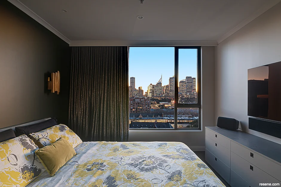
Throughout her career, Nadine has worked across a broad range of project types, from private residential homes and high-end apartments to commercial offices, schools and aged care facilities. Multi-family residential projects have become one of Nadine’s specialties, which speaks volumes to her ability to build trust in projects with many stakeholders. “Strata projects are unique because you’re often designing for a whole community rather than a single client. There’s usually a committee involved, which means balancing different opinions, budgets and priorities. It’s a more collaborative process – and you need to design with longevity, durability and broad appeal in mind – but I love the challenge,” she says.
Of all her projects, there are two that have really stood out for Nadine. “The first is Holy Spirit Primary School, where we created custom-designed wallpaper and stenciled images inspired by the school’s core values,” she says. “It was such a rewarding experience because we weren’t just designing a space, we were visually expressing what the school stood for. It brought real meaning to the environment, and seeing students and staff respond so positively to it was incredibly fulfilling. The other would be my Potts Point project. That project was a beautiful example of how collaboration and trust can shape a space. The client was involved every step of the way, and the result was a sophisticated, layered interior that felt deeply personal and refined. Both projects, while completely different in scope, were successful because they were grounded in strong communication, purpose and connection.”

Depth and intention have always been part of Nadine’s work, and she sees colour as a deliberate and foundational element in her approach. “Colour is one of the most powerful tools in design and it should evoke emotion, enhance the space and tell a story. I don’t see it as just a finishing touch; it’s a foundational element that influences how a space is experienced. Whether I'm working with bold hues or subtle neutrals, I consider light, materiality and context to ensure colour is integrated meaningfully,” she says.
“Broadly speaking, many people tend to lean toward safe, neutral palettes. While this creates calm and cohesive interiors, it can also lead to a lack of personality or uniqueness. I believe this cautious approach stems from a combination of real estate-driven decisions like resale value and fear of getting it wrong. I’d love to see more Australians and New Zealanders embrace colour with confidence. Even subtle injections, such as a painted ceiling, coloured cabinetry or a statement wall can transform a space and reflect individual identity.”

Nadine sees Resene products as an essential part of her colour-driven practice. “Resene has long been a trusted name in the industry. Their extensive and well-curated colour library is a designer’s dream. There’s a shade for every mood and moment. I especially appreciate their colour tools like Resene ColourMatch Online and drawdowns, which make the specifying process far smoother and more accurate. I also value that Resene is a family-owned New Zealand business with a strong sustainability ethos. It makes a difference knowing you're working with a brand that’s both ethical and innovative and using products made in our corner of the world.”
While Nadine has too many favourite Resene colours to name, she singled out two hues that she’s looking forward to using more of. “I’m currently loving Resene Half Rivergum, which is a muted green grey that strikes the perfect balance between grounded and calming. I also love Resene Toffee, a caramel hue that I would love to see on an exterior.”

Throughout her career, one piece of advice has stuck with Nadine and continues to inform her creative process. “Good design solves problems; great design tells a story. It reminds me that design is never in a vacuum. There should always be a narrative behind each decision,” she says.
This philosophy underscores every space she creates, ensuring each project is not only visually compelling but also deeply personal, with colour and narrative woven seamlessly into the design. As she looks to the future, Nadine shows no signs of slowing down as she continues pushing creative boundaries one bold brushstroke at a time.
Nadine's top tips
-
Think beyond the walls. Colour can (and should) be used on ceilings, trims, cabinetry and even floors. This creates a cohesive palette that allows for creative expression in unexpected areas.
-
Don’t rely solely on digital swatches. They’re a good starting point, but drawdowns and painted samples give a far more accurate representation. Resene's tools are especially helpful for this.
-
Always test your colours in context. Lighting changes everything. Sample your colours in the actual space on multiple walls and observe them at different times of day before finalising your selection.
To see more of Nadine’s work, visit her website at www.dnadesign.com.au.
Colours mentioned in this article


