Beyond the swatch
From BlackWhite magazine - issue 11, spectrum science
Why sample size matters in the critical evaluation of colour.
There are few things more disappointing than feeling like you’ve completely nailed your colour and material palette coordination only to discover that something seems off once your project comes to life.
When it comes to choosing paint colours, it’s imperative to ensure that you view a large enough sample to be able to critically evaluate the hue and get a true impression of its undertone and subtleties.
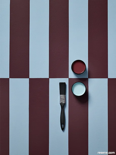
Background and testpots in Resene Dream Big and Resene Transition. Projects by Amber Armitage, images by Melanie Jenkins and Bryce Carleton.

Since colours are directly influenced by adjacent colours, it’s crucial to view your Resene colour samples with the other colours and materials that will be used in your project to ensure their compatibility. Whenever possible, these should be viewed in situ so that you can also evaluate how your palette will be influenced by your project’s natural and artificial lighting circumstances.
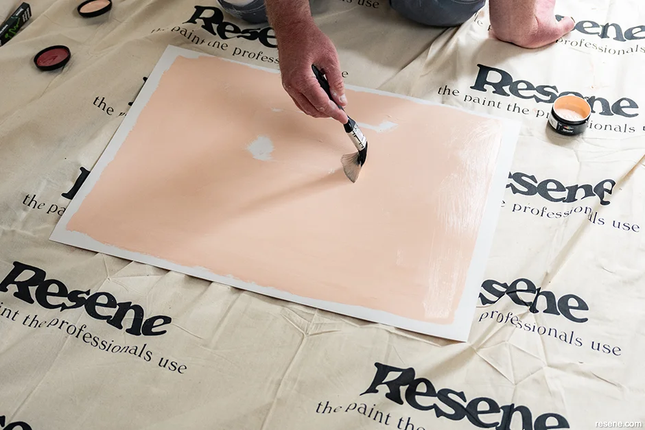
A4 drawdown paint swatches and testpots (from top) in Resene Transition, Resene Coral Tree, Resene Quarter Merino and Resene Dream Big.
When the client is waiting, deadlines are looming and you’re under pressure to get your design selections locked in, it can be tempting to make quick decisions and select a colour from your trusty Resene fan deck alone. One of the wonderful things about the paint swatches that appear on your favourite Resene fandecks and colour charts is that they’re screen-printed with real Resene paint. This means that, while most other paint companies’ swatches are only printed approximations of their colour offerings, what you see on your Resene swatch is the actual colour that you’ll find in your tin.
However, these compact swatches, which aren’t much larger than a postage stamp, only really offer a taste of the colour selections at your fingertips. The reality of how that colour will look once applied to a wall, ceiling or façade can’t be captured with such a small sample. Instead, Resene fandecks, colour charts and colour cards should be treated as a starting point before embarking on more rigorous testing.

Exterior wall painted in Resene Sour Dough with Resene FX Paint Effects Medium coloured with Resene Blanc applied on top, floor in Resene ConcreteWash satin tinted to Resene Claywash, plant pots in (from left to right) Resene ConcreteWash satin tinted to Resene Claywash (applied in a criss-cross effect) and Resene ConcreteWash satin tinted to Resene Stonewash (applied in a criss-cross effect).
Missing the big picture
Beyond the aesthetic advantages, viewing large enough colour samples in situ can prevent costly revisions. Relying solely on small swatches risks not only missing the true character of a colour but you may misunderstand its undertones and subtle shifts in hue that reveal themselves only in context. The need to repaint because the selected colour doesn’t look as expected can have budgetary and timeline repercussions. In commercial projects where you’re trying to match specific branding colours, it can also affect client satisfaction, so spending a little extra time on proper testing becomes a pragmatic form of risk management.
Subtle differences that may seem unimportant on colour charts can be significant once your selections are used at scale. For example, three blacks viewed only as standard swatch size may seem interchangeable. However, one black may have as a base hue in green while another has blue and the third includes yellow. On a small swatch, these undertones may be almost invisible. But when applied to a larger area, they can emerge with startling clarity. A neutral beige might suddenly lean pink or a pale blue may reveal an underlying green. These nuances can disrupt your intended design harmony, particularly when the paint colour needs to balance with other materials like timber, textiles, appliances and fixtures.
How large is large enough?
Small swatches compress information. The human eye perceives colour differently depending on its scale; a deep charcoal that feels rich and balanced in a 2cm rectangle may appear far darker and more dominating when it’s carried across an entire wall. The reverse is equally true – a pale grey that reads as soft on a fan deck can be unexpectedly cool or washed out when viewed over a larger area. Without viewing a more generously sized sample, you risk selecting something that may behave entirely differently once applied.
Depending on what stage you’re at in the selection process, these page sizes are the ideal scales of reference you will want to use for evaluating colour samples:
Approximate evaluation: A6 (155.4cm2)
General evaluation: A4 ( 623.7 cm2)
Critical evaluation: A2 (2.49m2)
did you know? If the Resene BS5252 colour chart was made of swatches suitably sized for the critical evaluation of every colour included on it, its dimensions would be 3.65m x 12.63m. The need for samples that would be large enough for the critical evaluation of colour is what led Resene to develop testpots.
Whenever possible, a brushout tested in situ is the gold standard. Standard sized Resene testpots include enough low sheen waterborne paint to cover nearly 1m2 in two coats. At this scale, your colour’s personality becomes unmistakable.
While the contents of a testpot can be applied directly to a wall, it can be advantageous to apply it to an A2 size piece of cardboard instead. Once dry, you can tape your sample to a wall, move it to different positions within the space, and observe how it shifts under natural daylight and artificial lighting.
Since colour perception is also affected by the background on which it is viewed, its recommended to leave at least a 2cm border around your brushout. A2 size brushout cards are available by request at your local Resene ColorShop. These cards include adequate border markings to ensure there is enough white space around your brushout so that the background you view your sample up against doesn’t visually interfere with your perception of your chosen colour.
For professional architects, designers and trade painters, an A4 drawdown should be the bare minimum for evaluating your paint colour. At this size, the colour has enough surface area for your eye to begin perceiving its true depth and undertone, and you can place it directly alongside other material samples to test for compatibility. Specifiers can order Resene drawdowns for free online or in person at your local Resene ColorShop.
top tip Wet paint usually appears lighter colour than it does once it dries, so be sure to allow your brushout to dry fully before using it as a colour sample.
Light and location affect perception
As the sun moves across the sky, the natural light that your project is exposed to will differ from hour to hour. This can affect the way your paint colours and other materials interact in complex ways. The difference between a colour that works and one that disappoints can hinge on not just whether you evaluated its true character at a proper scale, but also where and how you viewed your samples.

In New Zealand and Australia, our natural light has a distinctive quality. It’s crisp, bright and often more intense and bluer than in many northern hemisphere locations. A clear winter’s day in Northern Europe receives about 600 watts of illuminance per square metre and is deficient in blue/violet waves – compared to the tropics, which receive 1,400 watts per square metre on average and a full complement of blue/violet waves. The same hue would look very different when viewed in these locations and conditions. This intensity can make pale shades appear starker, while deep colours may seem more saturated than anticipated. Artificial lighting adds another variable; the visible colour temperature of light fittings, their placement and their interaction with reflective surfaces all affect how paint is perceived.
Since light and colour are intrinsically connected, it’s important to view your shortlisted colour and material selections in situ whenever possible. Colour shows up best in broad daylight, and as evening falls, it becomes increasingly indistinguishable until the objects appear either black or grey. Even daylight varies considerably in spectral distribution so colours look different in direct sunlight than they do when the sky is overcast. When colours are viewed in artificial lights, differences become even greater. For instance, lamps that are high in blue wavelength light make everything viewed by it look bluer while those high in yellow wavelength light cast a yellow glow.
Once applied to a wall, your paint colour will also be affected by the amount of light in the room and its source, other colours present, the colour of the substrate or primer your paint has been applied to, the texture of the wall, the sheen level of the paint, the size of the room itself and the area being painted. In other words, variations are caused by colour absorption, reflection and saturation, by the characteristics of the paint itself and variations in surfaces to be painted – which will all affect it. Add to this the complication that different people of different ages, genders and abilities may perceive the same colour differently, the only way to get a true impression of your colours is to view larger samples in situ.
The surface texture of your substrate and the sheen level of your paint also affect the way your colour selection is perceived. A colour with a gloss finish will appear richer, brighter and more intense than the same colour will in a flat finish. A smooth surface also returns more direct reflection and may make your paint colour appear lighter or more vivid, whereas a textured surface diffuses light and can mute or darken the colour. Certain clear reds and yellows may also. So, if you want to be absolutely sure about how your colour will appear once your project is complete, you may wish to test a sample of your selected colour tinted into your chosen product and sheen level and apply it to the same surface or substrate.
top tip While it may be tempting to pick fashion colours from Europe, these colours won’t react the same under our local natural lighting and can often appear too ‘sweet’. Instead, colours with a more greyed-off or dusty appearance and nature inspired hues are often better options to comfortably embrace the intensity of our light.
Integrate proper testing into your process
Making larger colour sampling a standard part of your workflow benefits not only your projects but also your client relationships. Presenting A4 or A2 samples alongside material boards communicates professionalism and attention to detail. It invites clients into the decision-making process with a greater level of confidence that smaller swatches simply can’t provide.
For exteriors, brushouts should be tested directly on-site and applied to the actual substrate or a spare piece of the cladding material whenever possible. This approach reveals how surface texture, gloss level and environmental factors like shadows cast by adjacent structures and foliage will influence perception. For interior projects, place the samples in the intended location in the same orientation to the colour that will be used. This can be particularly important for colours applied to ceilings and horizontal surfaces as the direction that the light hits the sample can drastically change its appearance.
Colour is a critical design element with the power to define mood, alter spatial perception and integrate or separate components of a design – and as professionals, we carry the responsibility of translating our clients’ vision into a physical reality. This extends to ensuring the right Resene paint finish and system is selected and applied. The next time you find yourself tempted by the convenience of a fan deck decision, pause, reach instead for the A4 drawdown – or better yet, take the time to brushout a testpot – and watch how your Resene colour selection behaves in the reality of your project’s light, texture and material story. Making decisions under conditions that mirror the reality of the finished space – and with samples at a large enough scale – ensures everyone will be pleased with the project’s outcome.
Best practices for evaluating colour
Start bigger than a swatch
Use an A4 drawdown paint swatch as your minimum sample size. Since Resene drawdowns are made with real Resene paint rather than a printed facsimile, drawdowns are a true representation of your Resene colour.
Go larger when possible
Opt for an A2 brushout to see how the colour behaves at scale.
Test in situ
Whenever possible, view your sample exactly where it will be used and view the colour from different positions and orientations.
Watch the light
Observe your samples at different times of the day and at night under artificial lighting. Keep in mind that our natural lighting circumstances in New Zealand and Australia can intensify certain colours and wash out others.
Compare with the rest of your palette
Place your paint and wood stain samples alongside other finishes, materials and textiles under the same lighting conditions to check their undertones and compatibility.
Apply your colour in the same sheen level to the actual substrate
Where possible, apply the sample to the actual surface type and texture for the most accurate impression.
Remember that scale affects intensity
If two or more adjacent walls are painted the same colour, the result will appear more intense than a single accent wall would alone. Since this effect can be difficult to imagine prior to painting, roll your A2 brushout into a loose tube with the painted surface on the inside. By looking down into the tube, you and your client can get an idea of effect the colour will have once applied to the full room.
Colours and products mentioned in this article


Resene Claywash